Saturday, 20 February 2010

Ed Ruscha


This is an artist who’s work I have only just become familiar with. His work is rich is experimentation, working with printed matter, graphic design, cinema, photography, painting and drawing he is strongly inspired by the flattened cultural landscape of the American West.

His work is highly conceptual and each piece has a fascinating story to go with it. However, I am just astounded by his use of text with imagery; I feel there is a great harmony between the two within his work. And I am very glad to have discovered him for myself!

Lovely..


Here are some completely beautiful examples of the infinite ways in which text can be used.

The Dawn of the Script of the Cherokees


“The illiterate Cherokee known as Sequoyah watched in awe as white settlers made marks on paper, convinced that these ‘talking leaves’ were the source of white power and success. This inspired the consuming ambition of his life: to create a Cherokee written language”.

I found this article in The New York Times. I think it is completely fascinating and exciting to think about the creation of an alphabet and therefore the creation of language. In the picture you can see on the right, the syllabary devised by the illiterate Indian in the 1800s. And above, characters found in a Kentucky cave which may be the earliest examples of the Cherokee script.

More Julie Arkell


Fiona Thompson


This is a ceramic plate that has been screen printed onto.

I have had a picture of this piece for a while now. I just love the simplicity of the piece and the bleeding effect of the text. This is a great example of the breadth of possibilities where text is concerned.

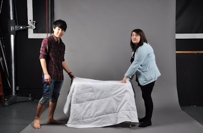
The Blanket

The Photoshoot

White-on-White


It's white because that is the color associated with hope, dreams and light, which is what positive memories are to us.
It's white-on-white because your memories are private to you and you wouldn't want them to be accessible to everybody else.

We each decided to stitch our positive memories and associations onto four pieces of white fabric and then stitch those together to make an example of a blanket that could be created out of memories.

I have chosen to do my stitching on fuzzy material that is very pleasant to touch, and then I just randomly stitched different positive memories and phrases that always made me smile onto each square.

T-shirt blanket


The idea of wrapping yourself in your positive memories is something that people are quite familiar with.
I have found a website of a girl, who offers to stitch blankets from people's old t-shirts that they are never going to wear again but that are too dear to part with. A blanket keeps you warm physically, just as your positive memories would always keep you warm mentally. This is why it is natural for us to have the desire of curling up in a blanket made out of warm memories.

Julie Arkell


Make do and mend. Waste not want not. A stitch in time saves nine…

These are all phrases that come to mind when I think about the work of Julie Arkell. She is known for her cute and curious creatures painstakingly made from an assortment of odds and ends.

She is a true advocate both in thrift and recycling. I admire her ability to re-use every last thread, scrap of wool and odd button to create objects that will amuse and delight for a long while to come.

At first glance one would not necessarily notice the use of text within her work, however upon closer inspection you realise just how important a part it does play within her work.

She uses newsprint and pages from storybooks heavily in the creation of her papier-mâché creatures; with the text usually visible across the faces of these critters. This use of newsprint and book pages enables you to catch glimpses of text such as ‘the result is silence…’ and ‘oh yes you do! I am not you wife…’ and you are left to ponder the ends of these sentences. She also uses a simple needle and thread spelling out ‘going to crocket class’, ‘little bruit’ and ‘pick up sticks’ to embellish the knitted and printed skirts and dungarees of these lucky individuals.

- Georgia

Paper Font


This is an image I have found on the web. I don't know who has created this typeface, but I love its experimental and playful nature.

Daniel Eatock - Alphabetape


"Alphabetape can be used as a text typeface by cutting individual letters from the tape, and as a set of instructions for a display typeface; large letters can be formed with the tape following the shapes of the printed letters."

I found inspiration in this piece due to its original, yet simple concept. It's interesting how letter forms can be made using anything and each time, a unique font is created.

stitches


These are stitches I have done as part of our final piece. As I have never done any stitching before It took me quite a while. I have made it really simple and clear which allowed the text to stand out effectively.

Vachira

Friday, 19 February 2010

Jack Featherstone


Jack Featherstone is a recent graduate of BA GDC from Chelsea (and my friends brother) He created a project called "Play with type" it has its own blog, http://playwithtype.blogspot.com/ its a fantastic body of work and motivational to what we can achieve with creative typography. Above is a small animation, which I find aesthetically pleasing really. It also is an example of how typography can be pushed into other dimensions.

Coney Island


These are some of my images of Coney Island in New York. Coney island is an incredibly strange place, its like a rundown seaside town stuck in a time warp, but Americanised. The typography here is obscene and crude, almost primitive typography. But its exactly what I like,
so bad its good.

Stefan Sagmiester


Sagmeister's piece is an incredible use of typography. It will probably appear on majority of typography blogs, but it is something that cannot go unnoticed. Essentially it is typography in its basic form, hand made marks on available material. But obviously in our society of type today, the impact of this was incredible. Its quite inspirational really, it shows how far we should be pushing the boundaries within typography design.

Barbara Kruger


Barbara Kruger is predominatley a photographer and collage artist, but the use of type in her work is highly striking.
In majority of her pieces she uses "Futura Bold" typeface, and almost uses it as a trademark. This sense of establishment with the use of type is very interesting to me and shows how powerful type can be.
http://www.barbarakruger.com/

Apologies

I do have to apologise about the order of our blog.
Blogger does not offer a reblog option but if you see
the links of the right ----------->
You can easily look through our research, ideas,
development and final work.


This is tomorrow

This is Tomorrow

http://cargocollective.com/thisistomorrow#63577/Breslau-Rediscovered


This piece was chosen to show how typography can be
experimental. It shows how type can be affected by its
media. It is a different and unusual approach to typographic
design, something as a group we can work with.
- Emma

Wes Wilson

Wes Wilson

http://www.wes-wilson.com/?page_id=14


Wes Wilson, a major American psychedelic artist created
typography that shows movement and fluidity.
Psychedelia typography was mainly influenced by art
nouveau, Victorian & Edwardian display Lettering,
however through distortion the type is made relevant to the time,
the 60's, the era of rock concerts and free Love.
The idea of wrapping type around predetermined spaces
makes me think seriously about form and structure of typography.
- Emma